12 Ceteris Paribus Plots
Ceteris paribus (CP) plots (Kuźba, Baranowska, and Biecek 2019) visualize how changes in a single feature change the prediction of a data point.
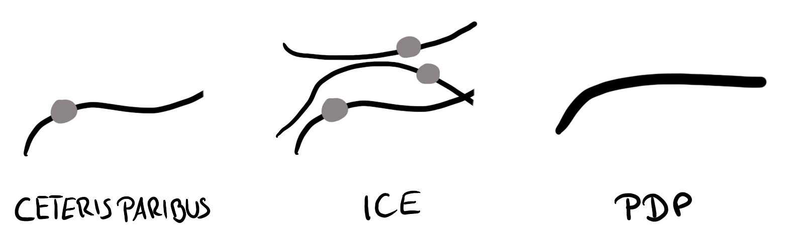
Ceteris paribus plots are one of the simplest analysis one can do, despite the complex-sounding Latin name, which stands for “other things equal” and means changing one feature but keeping the others untouched.1 It’s so simple since it only looks at one feature at a time, systematically changes its values, and plots how the prediction changes across the range of the feature. But ceteris paribus is the perfect model-agnostic method to start the book with, since it teaches the basic principles of model-agnostic interpretation. Also, don’t be deceived by the simplicity: By creatively combining multiple ceteris paribus curves2, you can compare models, features, and study multi-class classification models. CP curves are building blocks for Individual Conditional Expectation curves and Partial Dependence Plots, as visualized in Figure 12.1.
- ICE plots are CP plots containing all CP curves for an entire dataset.
- A partial dependence plot (PDP) is the average of all CP curves of one dataset.
Algorithm
Let’s get started with the ceteris paribus algorithm. This is also a little showcase of how things may seem more complex than they are when you use math. The following algorithm is for numerical features:
Input: Data point \(\mathbf{x}^{(i)}\) to explain and feature \(j\)
- Create an equidistant value grid: \(z_1, \ldots, z_K\), where typically \(z_1 = \min(\mathbf{x}_j)\) and \(z_K = \max(\mathbf{x}_j)\).
- For each grid value \(z_k \in \{z_1, \ldots, z_K\}\):
- Create new data point \(\mathbf{x}^{(i)}_{x_j := z_k}\)
- Get prediction \(\hat{f}(\mathbf{x}^{(i)}_{x_j := z_k})\)
- Visualize the CP curves:
- Plot line for data points \(\left\{z_l, \hat{f}(\mathbf{x}^{(i)}_{x_j := z_k})\right\}_{k=1}^K\)
- Plot dot for original data point \(\left(\mathbf{x}_k^{(i)}, \hat{f}(\mathbf{x}^{(i)})\right)\)
The more grid values, the more fine-grained the CP curve, but the more calls you have to make to the predict function of the model. And for a categorical feature:
- Create list of unique categories \(z_1, \ldots, z_K\)
- For each category \(z_k \in \{z_1, \ldots, z_K\}\):
- Create new data point \(\mathbf{x}^{(i)}_{x_j := z_k}\)
- Get prediction \(\hat{f}(\mathbf{x}^{(i)}_{x_j := z_k})\)
- Create bar plot or dot plot with categories on x-axis and predictions on y-axis.
But that sounded more complex than necessary. Let’s make CP plots more concrete with a few examples.
Examples
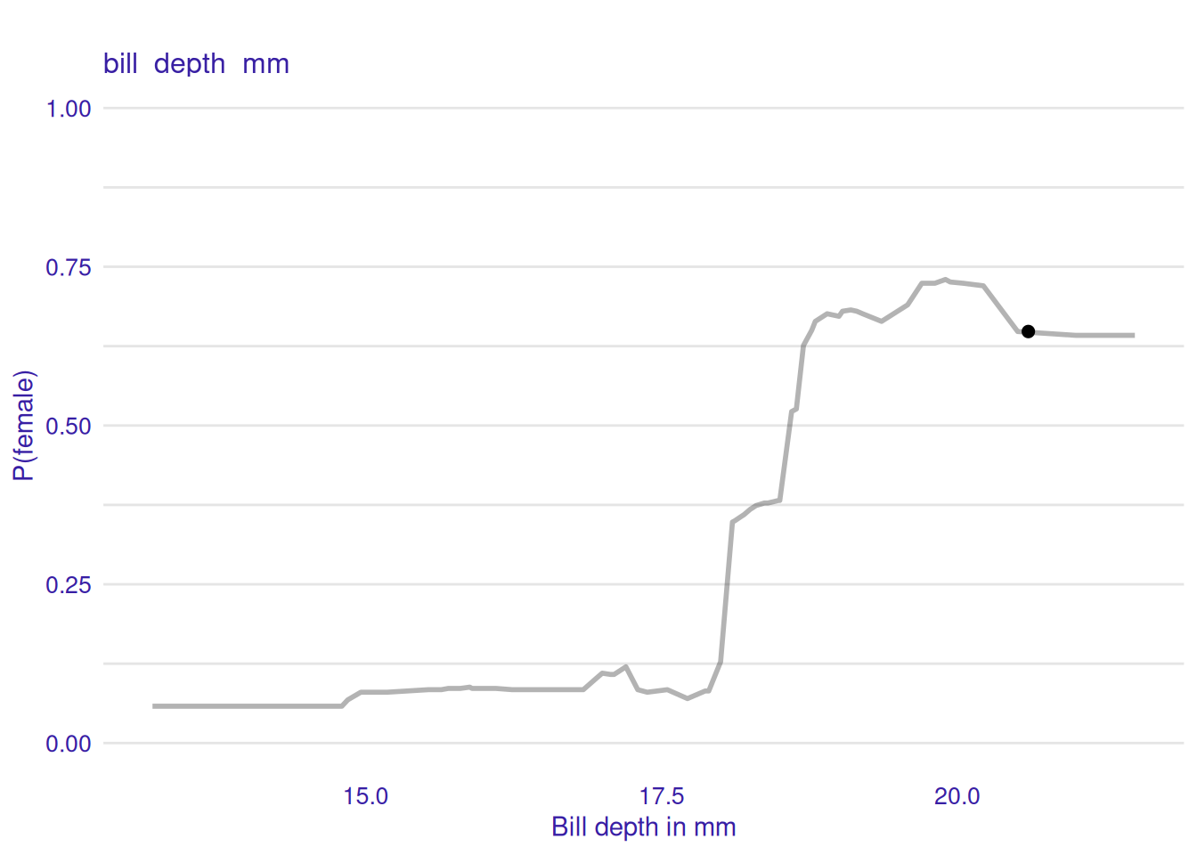
For our first example, we look at the random forest predicting the probability of a penguin being female. We look at the first penguin in the test dataset, a Adelie penguin with a bill depth of 20.6 millimeters (ground truth male). Figure 12.2 shows that decreasing the bill depth of this penguin first slightly increases the predicted P(female), but then greatly decreases P(female).
Since it’s a binary classification task, visualizing \(\mathbb{P}(Y = \text{male})\) is redundant – it would just be the inverted \(\mathbb{P}(Y = \text{female})\) plot. But if we had more than two classes, we could plot the ceteris paribus curves for all the classes in one plot.
Again, we have to keep in mind that changing a feature can break the dependence with other features. Looking at correlation and other dependence measures can be helpful. Bill depth is correlated with body mass and flipper length. So when looking at Figure 12.2, we should keep in mind not to over-interpret strong reductions in bill depth in this ceteris paribus plot.
Look beyond pairwise dependencies
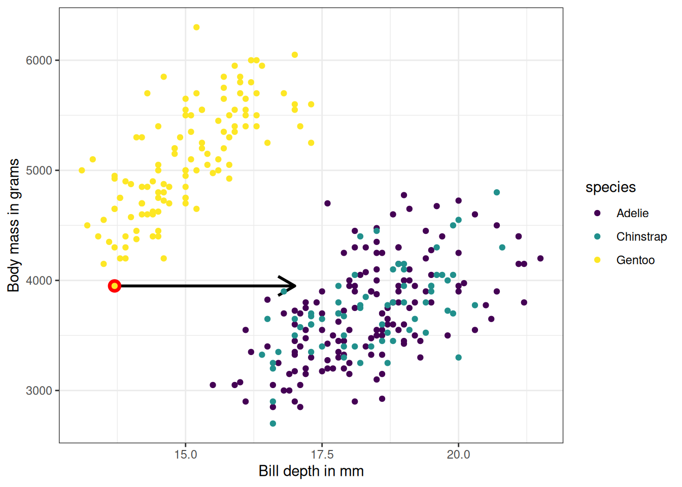
Figure 12.3 shows an example where we artificially change the bill depth feature of the lightest Gentoo penguin. The data point is realistic when we only look at the combination of body mass and bill depth. It’s also realistic when we only look at bill depth and species. However, it’s unrealistic when considering the new bill depth, body mass, and species together.
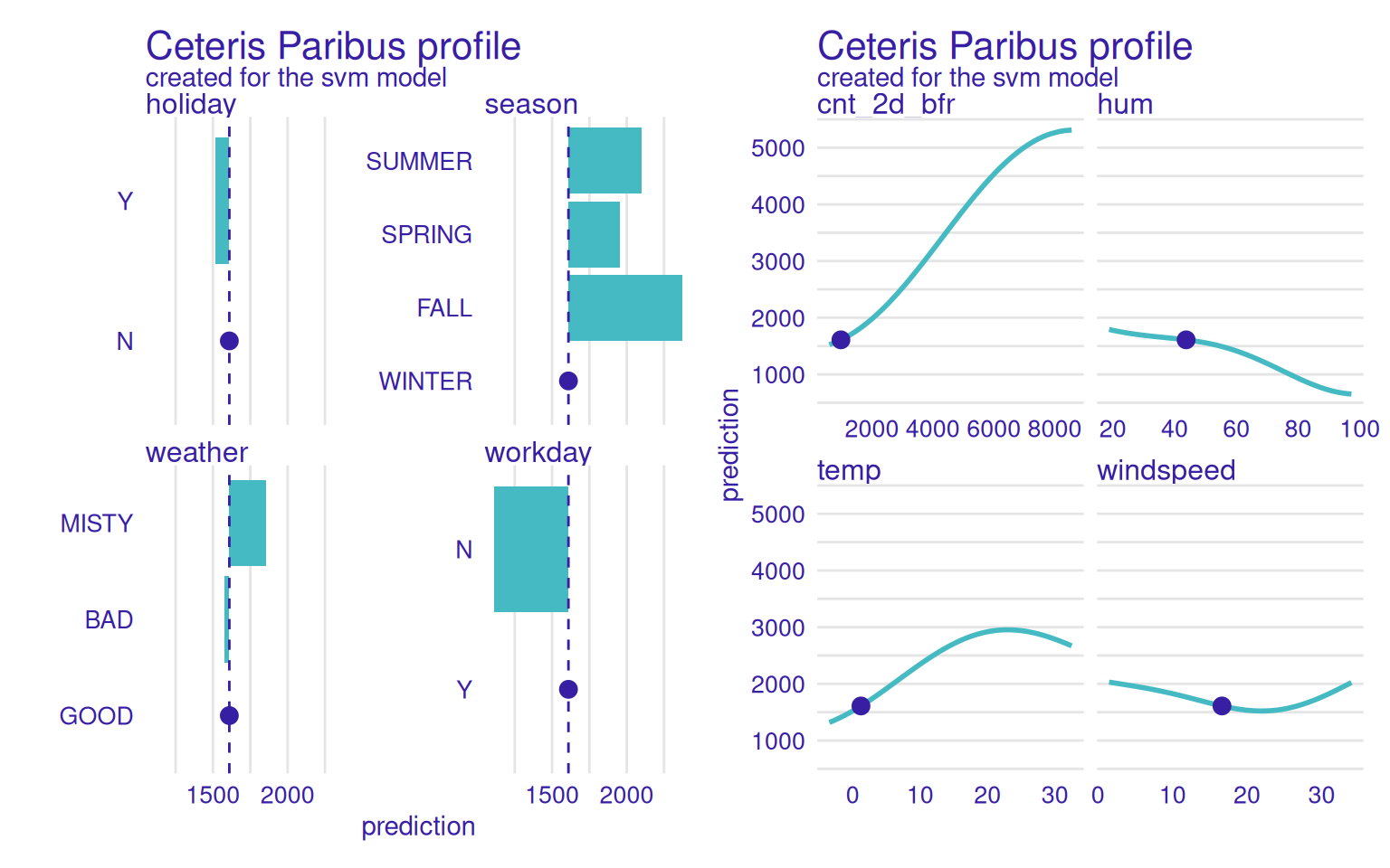
Next, we study the SVM predicting the number of rented bikes based on weather and seasonal information. We pick a winter day with good weather and see how changing the features would change the prediction. But this time we visualize it for all features, see Figure 12.4. Changes in the number of rented bikes 2 days before would change the prediction the most. Also, a higher temperature would have been better for more bike rentals. Were the prediction for a non-workday, the SVM would predict fewer bike rentals.
Minimal version with sparklines
CP plots can be packaged into sparklines, a minimalistic line-plot popularized by Tufte and Graves-Morris (1983).
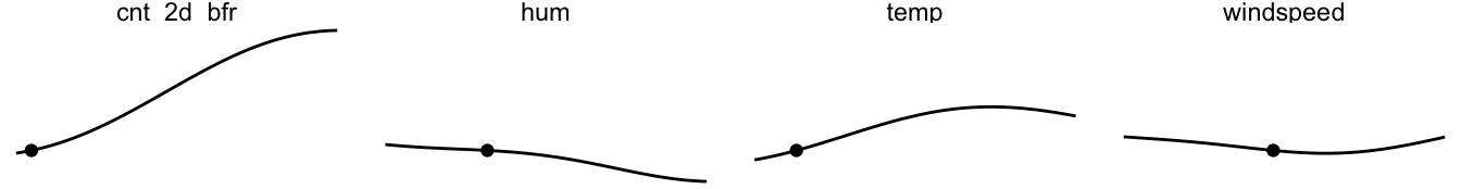
In general, the CP plots show how feature changes affect the prediction, from small changes to large changes in all directions. By comparing all the features side-by-side with a shared y-axis, we can see which feature has more influence on this data point’s prediction. However, correlation between features is a concern, especially when interpreting the CP curve far away from the original value (marked with a dot). For example, increasing the temperature to 30 degrees Celsius, but keeping the season the same (winter) would be quite unrealistic.
Ceteris paribus plots are super flexible. We can compute CP curves for different models to better understand how they treat features differently. In Figure 12.5, we compare the ceteris paribus plots for different models.
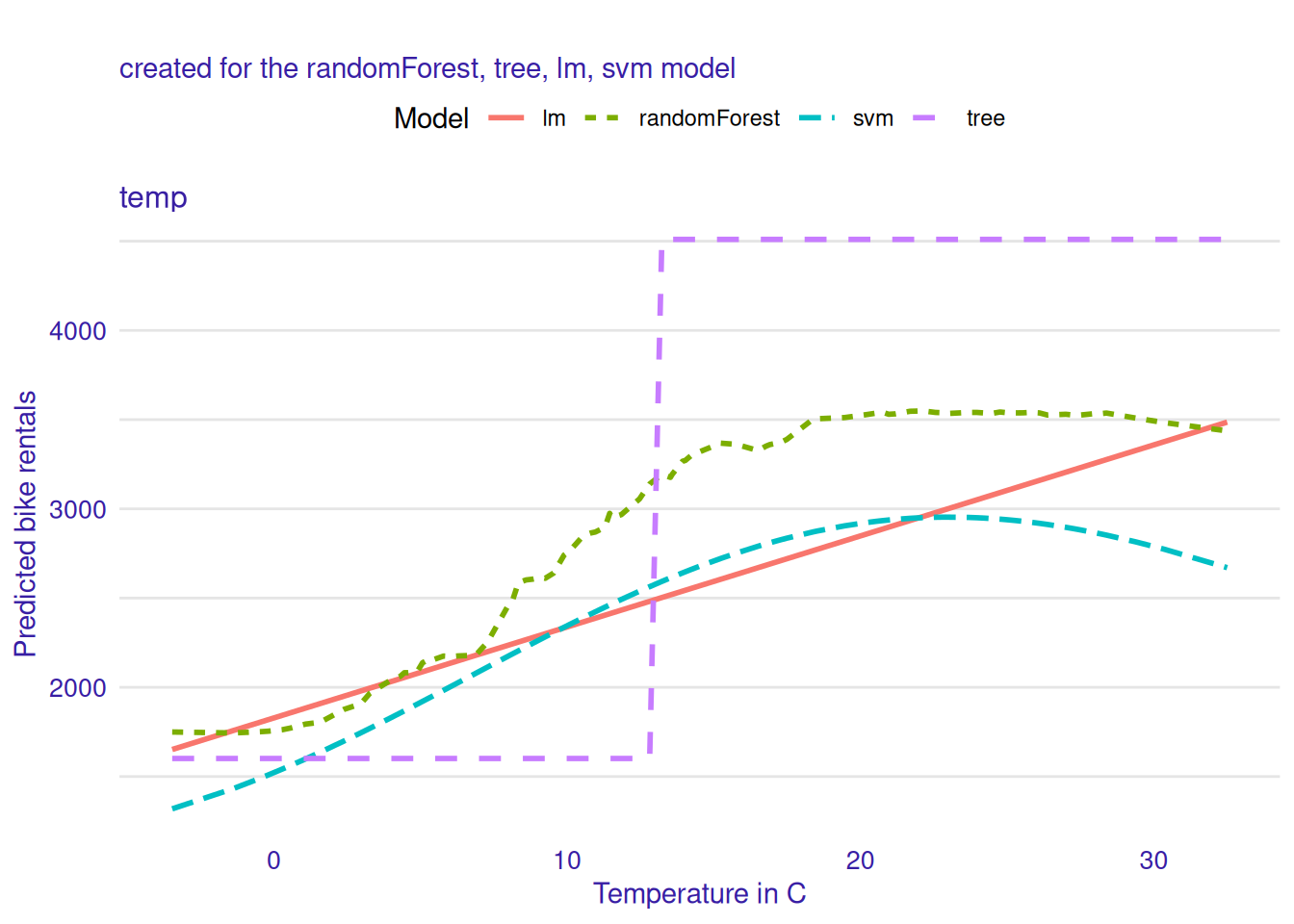
Here we can see how very different the models behave: The linear model does what linear models do and models the relation linearly between temperature and predicted bike rentals. The tree shows one jump. The random forest and the SVM model show a smoother increase, which flattens at high temperature, and, in the case of the SVM, slightly decreases for very high temperatures.
Be creative with comparisons
Ceteris paribus plots are simple, yet surprisingly insightful when you combine multiple CP curves:
- Compare features.
- Compare models from different machine learning algorithms or with different hyperparameter settings.
- Compare class probabilities.
- Compare different data points (see also ICE curves).
- Subset the data (e.g., by a binary feature) and compare CP curves.
Strengths
Ceteris paribus plots are super simple to implement and understand. This makes them a great entry point for beginners, but also for communicating model-agnostic explainability to others, especially non-experts.
CP plots can fix limitations of attribution methods. Attribution-based methods like SHAP or LIME don’t show how sensitive the prediction function is to local changes. Ceteris paribus plots can complement attribution-based techniques and provide a complete picture when it comes to explaining individual predictions.
Ceteris paribus plots are flexible building blocks. They are building blocks for other interpretation methods, but you can also get creative in combining these lines across models, classes, hyperparameter settings, and features to create nuanced insights into the model predictions.
Limitations
Ceteris paribus plots only show us one feature change at a time. This means we don’t see how two features interact. Of course, you can change two features, especially if one is continuous and the other binary, and plot them in the same CP plot. But it’s a more manual process.
Interpretation suffers when features are correlated. When features are correlated, not all parts of the curve are likely or might even be completely unrealistic. This can be alleviated by e.g. restricting the range of the ceteris paribus plots to shorter ranges, at least for correlated features. But this would also mean we need a model or procedure to tell us what these ranges are.
In general, you must be careful with causal interpretation; or if you want one, make sure the model itself is causal. This is a problem with all interpretation methods, but the risk of wrongful causal interpretation may be higher with CP plots since there is a lower barrier to showing the plots to non-experts.
Software and alternatives
I created all plots in this chapter with the ceterisParibus R package. It also has a Python implementation. You can further create CP plots with any tool that can produce ICE plots, like ICEBox and iml, by simply providing a “dataset” that only contains the one data point you are interested in. However, the ceterisParibus package is better suited because it makes it simpler to compare ceteris paribus curves.
I’m not a fan of the Latin name, because in school they promised that Latin helps with learning other Latin-based languages, like Italian. But you know what even helps better when your goal is to learn Italian? That’s right. Just learn Italian.↩︎
By “CP curve” I mean a single line, and by “CP plot” I mean a graph showing one or more CP curves.↩︎