13 Individual Conditional Expectation (ICE)
Individual Conditional Expectation (ICE) plots display one line per instance that shows how the instance’s prediction changes when a feature changes. An ICE plot (Goldstein et al. 2015) visualizes the dependence of the prediction on a feature for each instance separately, resulting in one line per instance of a dataset. The values for a line (and one instance) can be computed by keeping all other features the same, creating variants of this instance by replacing the feature’s value with values from a grid, and making predictions with the black box model for these newly created instances. The result is a set of points for an instance with the feature value from the grid and the respective predictions. In other words, ICE plots are all the ceteris paribus curves for a dataset in one plot.
Examples
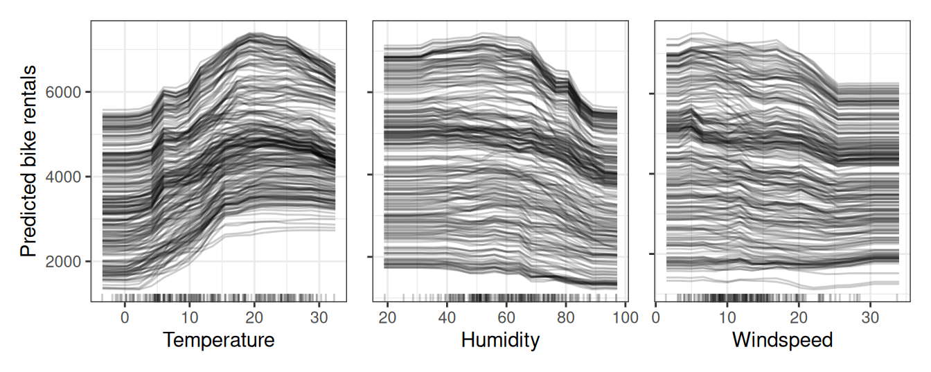
Figure 13.1 shows ICE plots for the bike rental prediction. The underlying prediction model is a random forest. All curves seem to follow the same course, so there are no obvious interactions.
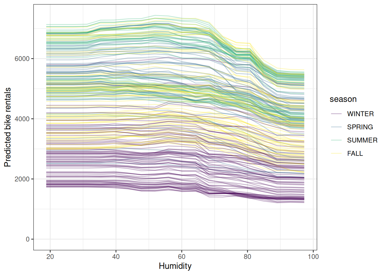
But we can also explore possible interactions by modifying the ICE plot. Figure 13.2 shows again the ICE plot for humidity, with the difference that the lines are now colored by the season. This shows a couple of things: First – and that’s not surprising – different seasons have different “intercepts”. Meaning that, for example, winter days have a lower prediction and summer the highest ones, independent of the humidity. But Figure 13.2 also shows that the effect of the humidity differs for the seasons: In winter, an increase in humidity only slightly reduces the predicted number of bike rentals. For summer, the predicted bike rentals stay more or less flat between 20% and 60% relative humidity and above 60% they drop by quite a bit. Humidity effects for spring and fall seem to be a mix of the “winter flatness” and the “summer jump”. However, as indicated by the boxplots in Figure 13.2, we shouldn’t over-interpret very low humidity effects for summer and fall.
Use transparency and color
If lines overlap heavily in a boxplot you can try to make them slightly transparent. If that doesn’t help, you may be better off with a partial dependence plot. By coloring the lines based on another feature’s value, you can study interactions.
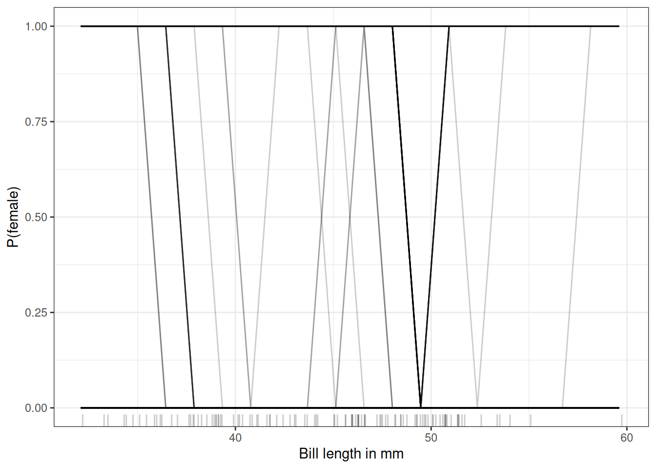
Let’s go back to the penguin classification task and see how the prediction of each instance is related to the feature bill_length_mm. We’ll analyze a random forest that predicts the probability of a penguin being female given body measurements. Figure 13.3 is a rather ugly ICE plot. But sometimes that’s the reality. The reason is that the model is rather sure for most penguins and jumps between 0 and 1.
Centered ICE plot
There’s a problem with ICE plots: Sometimes it can be hard to tell whether the ICE curves differ between data points because they start at different predictions. A simple solution is to center the curves at a certain point in the feature and display only the difference in the prediction to this point. The resulting plot is called centered ICE plot (c-ICE). Anchoring the curves at the lower end of the feature is a good choice. Each curve is defined as:
\[ICE^{(i)}_j(x_j) = \hat{f}(x_j, \mathbf{x}^{(i)}_{-j}) - \hat{f}(a, \mathbf{x}_{-j}^{(i)})\]
where \(\hat{f}\) is the fitted model, and \(a\) is the anchor point.
Let’s have a look at a centered ICE plot for temperature for the bike rental prediction:
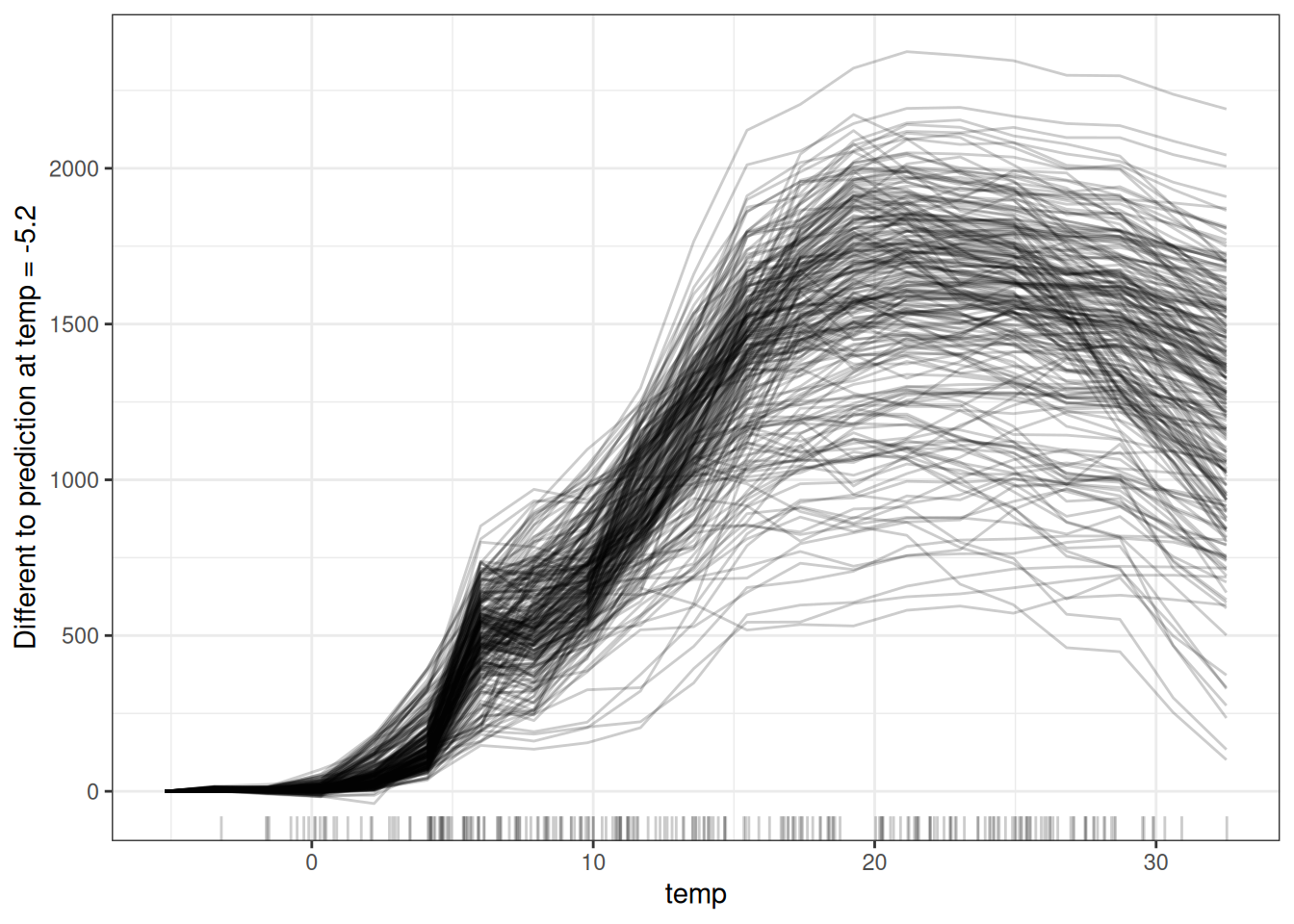
The centered ICE plots make it easier to compare the curves of individual instances. This can be useful if we do not want to see the absolute change of a predicted value, but the difference in the prediction compared to a fixed point of the feature range.
Derivative ICE plot
Another way to make it visually easier to spot heterogeneity is to look at the individual derivatives of the prediction function with respect to a feature. The resulting plot is called the derivative ICE plot (d-ICE). The derivatives of a function (or curve) tell you whether changes occur, and in which direction they occur. With the derivative ICE plot, it’s easy to spot ranges of feature values where the black box predictions change for (at least some) instances. If there is no interaction between the analyzed feature \(X_j\) and the other features \(X_{-j}\), then the prediction function can be expressed as:
\[\hat{f}(\mathbf{x}) = \hat{f}(x_j, \mathbf{x}_C) = g(x_j) + h(\mathbf{x}_{-j}), \quad\text{with}\quad\frac{\partial \hat{f}(\mathbf{x})}{\partial x_j} = g'(x_j)\]
Without interactions, the individual partial derivatives should be the same for all instances. If they differ, it’s due to interactions, and it becomes visible in the d-ICE plot. In addition to displaying the individual curves for the derivative of the prediction function with respect to the feature in \(j\), showing the standard deviation of the derivative helps to highlight regions in feature \(j\) with heterogeneity in the estimated derivatives. The derivative ICE plot takes a long time to compute and is rather impractical.
Strengths
Individual conditional expectation curves are intuitive to understand. One line represents the predictions for one instance if we vary the feature of interest.
ICE curves can uncover heterogeneous relationships.
Limitations
ICE curves can only display one feature meaningfully, because two features would require the drawing of several overlaying surfaces, and you would not see anything in the plot.
ICE curves suffer from correlation: If the feature of interest is correlated with the other features, then some points in the lines might be invalid data points according to the joint feature distribution.
If many ICE curves are drawn, the plot can become overcrowded, and you will not see anything. The solution: Either add some transparency to the lines or draw only a sample of the lines.
In ICE plots it might not be easy to see the average. This has a simple solution: Combine individual conditional expectation curves with the partial dependence plot.
Software and alternatives
ICE plots are implemented in the R packages iml (Molnar, Casalicchio, and Bischl 2018) (used for these examples), ICEbox, and pdp. Another R package that does something very similar to ICE is condvis. In Python, you can use PiML (Sudjianto et al. 2023).