| Model | RMSE | MAE |
|---|---|---|
| SVM | 852 | 628 |
| Random Forest | 883 | 676 |
| Linear Regression | 948 | 737 |
| Decision Tree | 1056 | 794 |
5 Data and Models
Throughout the book, there are two datasets that you will encounter often. One about bikes, the other about penguins. I love them both. This chapter presents the data and models that we will interpret in this book.
Bike rentals (regression)
This dataset contains daily counts of rented bikes from the bike rental company Capital-Bikeshare in Washington, D.C., along with weather and seasonal information. The data was kindly made openly available by Capital-Bikeshare. Fanaee-T and Gama (2014) added weather data and seasonal information. The data can be downloaded from the UCI Machine Learning Repository. I did a bit of data processing and ended up with these columns:
- Count of bikes, including both casual and registered users. The count is used as the target in the regression task (
cnt). - The season. Either spring, summer, fall, or winter (
season). - Indicator of whether the day was a holiday or not (
holiday). - Indicator of whether the day was a workday or weekend (
workday). - The weather situation on that day. One of: Good, Misty, Bad (
weather). - Temperature in degrees Celsius (
temp). - Relative humidity in percent (0 to 100) (
hum). - Wind speed in km per hour (
windspeed). - Count of rented bikes two days before (
cnt_2d_bfr).
I removed one day where the humidity was measured as 0, and the first two days due to missing count data two days before (cnt_2d_bfr). All in all, the processed data contains 728 days.
Predicting bike rentals
Since this example is just for showcasing the interpretability methods, I took some liberties. I pretend that the weather features are forecasts (they are not). That means our prediction task has the following shape: We predict tomorrow’s number of rented bikes based on weather forecasts, seasonal information, and how many bikes were rented yesterday.
I trained all regression models using a simple holdout strategy: 2/3 of the data for training and 1/3 for testing. The machine learning algorithms were: random forest, CART decision tree, support vector machine, and linear regression. Table 5.1 shows that the support vector machine performed best, since it had the lowest root mean squared error (RMSE) and the lowest mean absolute error (MAE). The random forest was slightly worse, and the linear regression model even more so. Trailing very far behind is the decision tree, which didn’t work out so well at all.
Feature dependence
For many interpretation methods, it’s important to understand how the features are correlated. Therefore, let’s have a look at the Pearson correlation for the numerical features. Table 5.2 shows that the only larger correlation is between count 2 days before and the temperature. But what about the categorical features? And what about non-linear correlation?
To understand the non-linear dependencies, we will do two things:
- Visualize the raw pairwise dependence (e.g., scatter plot)
- Compute the normalized mutual information (NMI) between two features.
| Variable 1 | Variable 2 | Correlation |
|---|---|---|
| temp | hum | 0.13 |
| temp | windspeed | -0.16 |
| hum | windspeed | -0.25 |
| temp | cnt_2d_bfr | 0.60 |
| hum | cnt_2d_bfr | 0.06 |
| windspeed | cnt_2d_bfr | -0.11 |
The normalized mutual information is a number between 0 and 1. An NMI of 0 means that the features share no information, while 1 means all variation stems from their dependence. The NMI can be biased upwards for features with a large number of categories/bins (Mahmoudi and Jemielniak 2024). That means the more bins/categories, the less you should trust a large NMI value. That’s why we also don’t rely on NMI alone, but visualize the raw data and analyze Pearson correlation.
Normalized Mutual Information
Mutual information between two categorical random variables \(X_j\) and \(X_k\) is given by:
\[ MI(X_j, X_k) = \sum_{c, d} \mathbb{P}(c, d) \log \frac{\mathbb{P}(c, d)}{\mathbb{P}(c) \mathbb{P}(d)}, \]
where \(c \in X_j\) and \(d \in X_k\). \(\mathbb{P}(c) = \mathbb{P}(X_j = c)\) is the probability that feature \(X_j\) takes on category \(c\), and the same for \(\mathbb{P}(d)\). \(\mathbb{P}(c, d) = \mathbb{P}(X_j = c, X_k = d)\) is the joint probability that feature \(X_j\) takes on category \(c\) and \(X_k\) category \(d\). Normalized mutual information scales MI from \([0, \infty[\) to \([0,1]\) (NMI may exceed this range under certain circumstances):
\[NMI(X_j, X_k) = \frac{2 \cdot MI(X_j, X_k)}{H(X_j) + H(X_k)}\]
where
\[ H(X_j) = -\sum_{c \in C_j} \mathbb{P}(c) \log \mathbb{P}(c). \]
Where \(C_j\) is the set of all categories \(X_j\) can take on. To use (normalized) mutual information with numerical features, we discretize the observed values \(\mathbf{x}_j\) of the feature \(X_j\) into equally sized bins. The number of bins is determined using the Freedman-Diaconis rule (Freedman and Diaconis 1981):
\[\text{nbins}_j = \left\lceil \frac{\max(\mathbf{x}_j) - \min(\mathbf{x}_j)}{2 \cdot \frac{\text{IQR}(\mathbf{x}_j)}{n^{1/3}}} \right\rceil\]
\(\text{IQR}(\mathbf{x}_j)\) is the interquartile range of \(\mathbf{x}_j\), \(n\) the number of data instances, and we round up to the next larger integer.
Now let’s have a look at the raw dependence data and the normalized mutual information for the features in the bike sharing data in Figure 5.1.
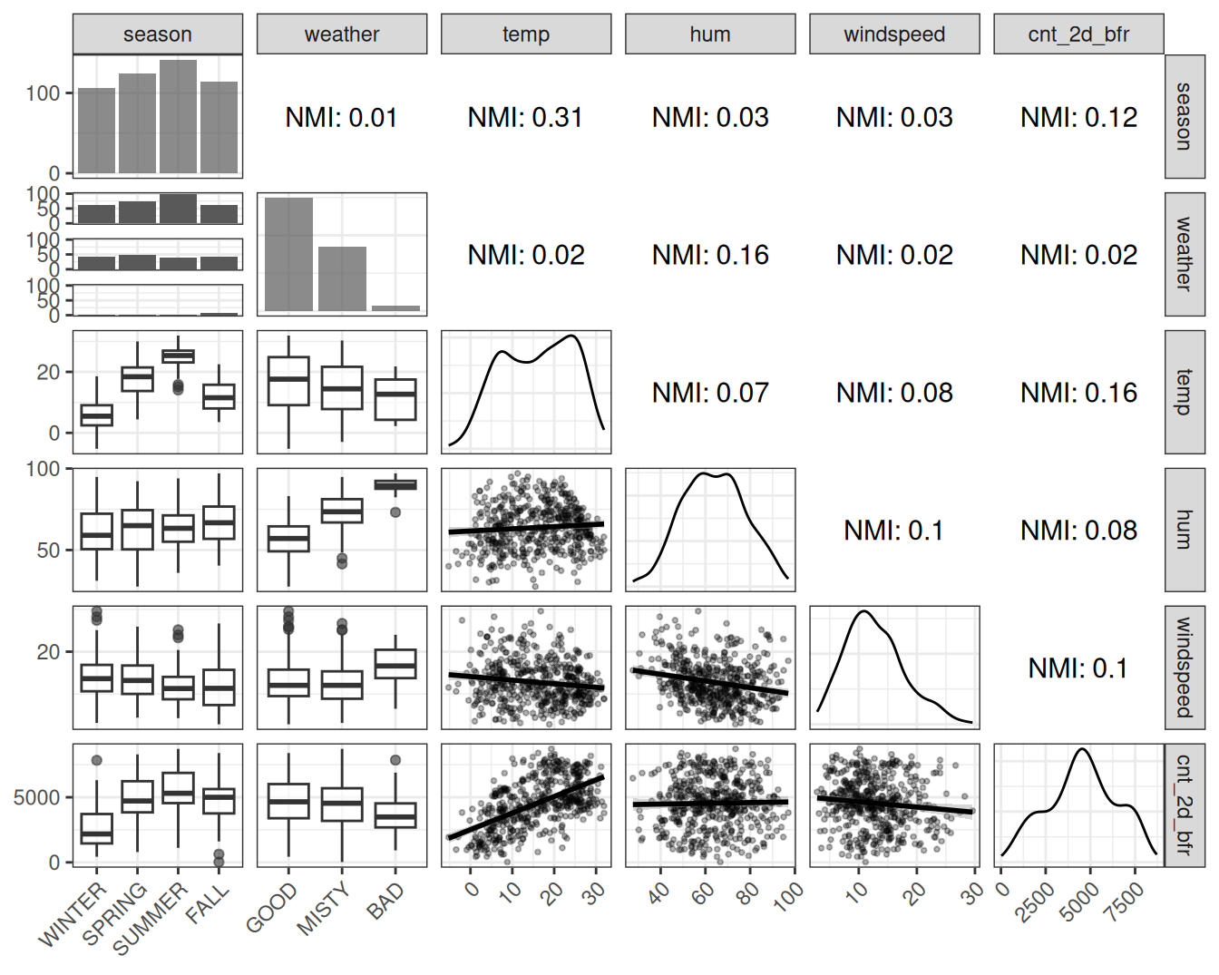
The NMI analysis overall confirms the impression from the correlation analysis. In addition, we get insights about the categorical features: The season shares information with temperature and count 2 days before, which isn’t surprising. The pair plots also confirm that correlation coefficients are good measures of dependence for this dataset, since the numerical features don’t show extravagant dependence patterns, but mostly linear ones. For the next data example, the dependence analysis has more surprises.
Palmer penguins (classification)
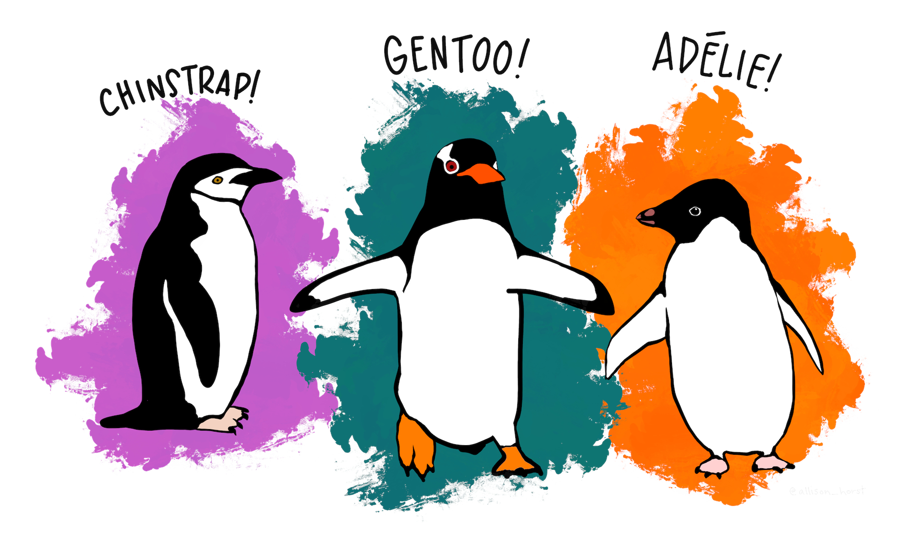
For classification, we will use the Palmer penguins data. This cute dataset contains measurements from 333 penguins from the Palmer Archipelago in Antarctica (visualized in Figure 5.2). The dataset was collected and published by Gorman, Williams, and Fraser (2014), and the Palmer Station in Antarctica, which is part of the Long Term Ecological Research Network. The paper studies differences in appearance between male and female, among other things. That’s why we’ll use male/female classification based on body measurements (as the dataset creators did in their paper).
Each row represents a penguin and contains the following information:
- Sex of the penguin (male/female), which is the classification target (
sex). - Species of penguin, which is one of Chinstrap, Gentoo, or Adelie (
species). - Body mass of the penguin, measured in grams (
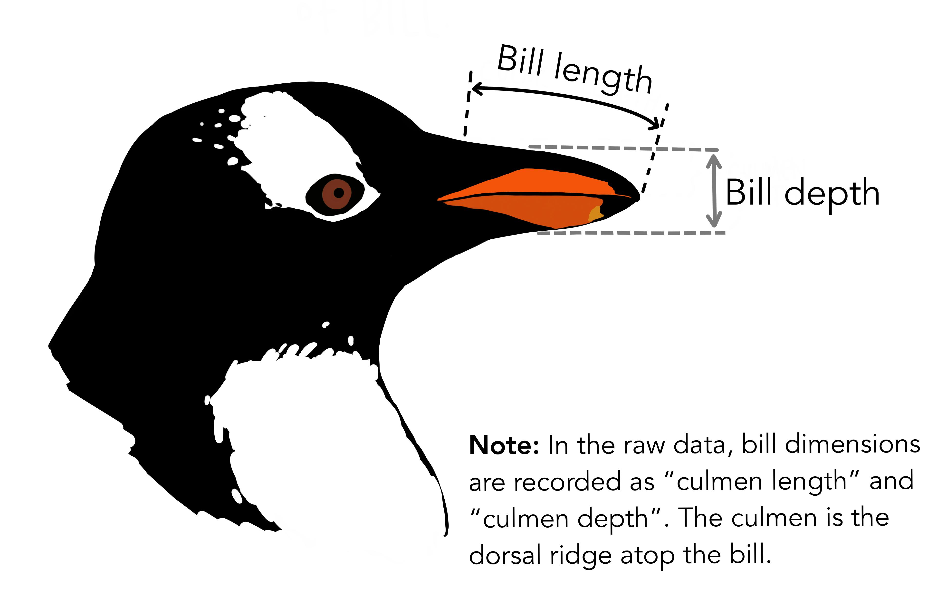
body_mass_g). - Length of the bill (the beak), measured in millimeters (
bill_length_mm). - Depth of the bill, measured in millimeters (
bill_depth_mm). - Length of the flipper (the “tail”), measured in millimeters (
flipper_length_mm).
11 penguins had missing data. Since the purpose of this data is to demonstrate interpretable machine learning methods and not an in-depth study of penguins, I simply dropped penguin data with missing values. The dataset is loaded using the palmerpenguins R package (Horst, Hill, and Gorman 2020).
Classifying penguin sex (male / female)
For the data examples, I trained the following models, using a simple split into training 2/3 and holdout test data 1/3. To assess the performance of the models, I measured log loss and accuracy on the test data. The results are shown in Table 5.3.
The logistic regression model is actually 3 models: I first split the data by species, trained a logistic regression model, and combined the performance results. That’s also what the Gorman, Williams, and Fraser (2014) did in their paper. This is also the model that performed best. For the random forest and for the decision tree, I treated species as a feature. This didn’t work out so well for the decision tree, but the performance of the random forest is close to the logistic regression models, at least in terms of accuracy.
| Model | Log_Loss | Accuracy |
|---|---|---|
| Logistic Regression (by Species) | 0.16 | 0.93 |
| Random Forest | 0.19 | 0.92 |
| Decision Tree | 1.23 | 0.86 |
Feature dependence
Let’s have a look at how the penguin body measurements are correlated (Pearson correlation).
| Variable 1 | Variable 2 | Correlation |
|---|---|---|
| bill_depth_mm | bill_length_mm | -0.23 |
| bill_depth_mm | flipper_length_mm | -0.58 |
| bill_length_mm | flipper_length_mm | 0.65 |
| bill_depth_mm | body_mass_g | -0.47 |
| bill_length_mm | body_mass_g | 0.59 |
| flipper_length_mm | body_mass_g | 0.87 |
Table 5.4 shows that especially the body mass and the flipper length are strongly correlated. But also other features are correlated, like flipper length and bill length, or flipper length and bill depth. However, Pearson correlation only tells half of the story, since it only measures linear dependence. Let’s have a look at the pair plots of the features, along with the normalized mutual information.
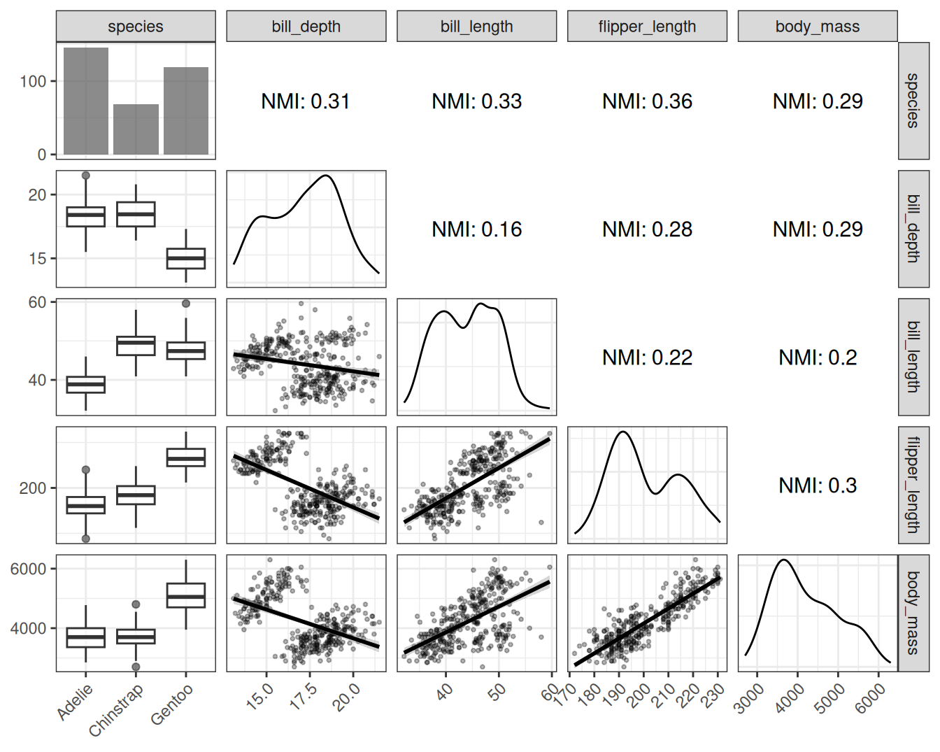
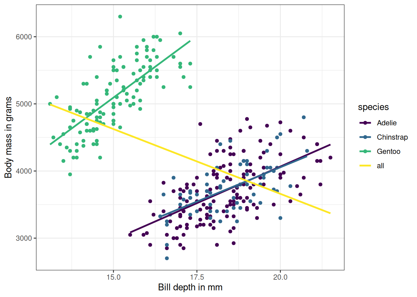
Figure 5.3 shows a much more nuanced picture than the Pearson correlation revealed. For example, the normalized mutual information between body mass and bill depth is similar to the NMI between body mass and flipper length. But the correlation between body mass and bill depth is much lower. The reason is that linear correlation isn’t capturing the dynamics, at least not when bundling all the penguins together. The reason why linear correlation doesn’t work well here is Simpson’s paradox. In the Simpson’s paradox a trend appears in several groups of the data, but disappears or flips when combining all data. Combining all penguin data turns a positive correlation between bill depth and body mass into a negative one, as shown in Figure 5.4. The reason is that Gentoo penguins are heavier and have deeper bills. Mutual information overcomes this problem.
A note on modeling all penguins together: Throughout the book, I’ll treat the penguins as one dataset by default, using species as a feature. Arguably, it might be better to always model and analyze the penguins by species. However, this is a very common tension in machine learning: Often, data instances belong to a cluster or entity – think of forecasting sales for different stores or classifying lab samples from the same batches – and we have to decide whether to use separate models or using the entity id as a feature.