19 Partial Dependence Plot (PDP)
The partial dependence plot (short PDP or PD plot) shows the marginal effect one or two features have on the predicted outcome of a machine learning model (Friedman 2001). A partial dependence plot can show whether the relationship between the target and a feature is linear, monotonic, or more complex. For example, when applied to a linear regression model, partial dependence plots always show a linear relationship.
Definition and estimation
The partial dependence function for regression is defined as:
\[\hat{f}_S(\mathbf{x}_S) = \mathbb{E}_{\mathbf{X}_C}\left[\hat{f}(\mathbf{x}_S, X_C)\right] = \int \hat{f}(\mathbf{x}_S, X_C) d\mathbb{P}(\mathbf{X}_C)\]
The \(\mathbf{x}_S\) are the features for which the partial dependence function should be plotted and \(X_C\) are the other features used in the machine learning model \(\hat{f}\), which are here treated as random variables. Usually, there is only one or two features in the set S. The feature(s) in S are those for which we want to know the effect on the prediction. The feature vectors \(\mathbf{x}_S\) and \(\mathbf{x}_C\) combined make up the total data \(\mathbf{X}\). Partial dependence works by marginalizing the machine learning model output over the distribution of the features in set C, so that the function shows the relationship between the features in set S we are interested in and the predicted outcome. By marginalizing over the other features, we get a function that depends only on features in S, with interactions with other features included.
The partial function \(\hat{f}_S\) is estimated by calculating averages in the training data, also known as the Monte Carlo method:
\[\hat{f}_S(\mathbf{x}_S) = \frac{1}{n} \sum_{i=1}^n \hat{f}(\mathbf{x}_S, \mathbf{x}^{(i)}_{C})\]
This is equivalent to averaging all the ICE curves of a dataset. The partial function tells us for given value(s) of features in set \(S\) what the average marginal effect on the prediction is. In this formula, \(\mathbf{x}^{(i)}_{C}\) are actual feature values from the dataset for the features in which we are not interested, and \(n\) is the number of instances in the dataset. The PDP treats the features in \(C\) regardless of their correlation with features in \(S\). In the case of correlation, the averages calculated for the partial dependence plot will include data points that are very unlikely or even impossible (see disadvantages).
Correlated features are a problem
Be cautious when interpreting PDPs for (strongly) correlated features: In this case, the partial dependence plot includes unrealistic data instances.
For classification where the machine learning model outputs probabilities, the partial dependence plot displays the probability for a certain class given different values for feature(s) in S. An easy way to deal with multiple classes is to draw one line or plot per class.
The partial dependence plot is a global method: The method considers all instances and gives a statement about the global relationship of a feature with the predicted outcome.
Categorical features
So far, we have only considered numerical features. For categorical features, the partial dependence is very easy to calculate. For each of the categories, we get a PDP estimate by forcing all data instances to have the same category. For example, if we look at the bike rental dataset and are interested in the partial dependence plot for the season, we get four numbers, one for each season. To compute the value for “summer”, we replace the season of all data instances with “summer” and average the predictions.
Examples
In practice, the set of features \(S\) usually only contains one feature or a maximum of two, because one feature produces 2D plots, and two features produce 3D plots. Everything beyond that is quite tricky.
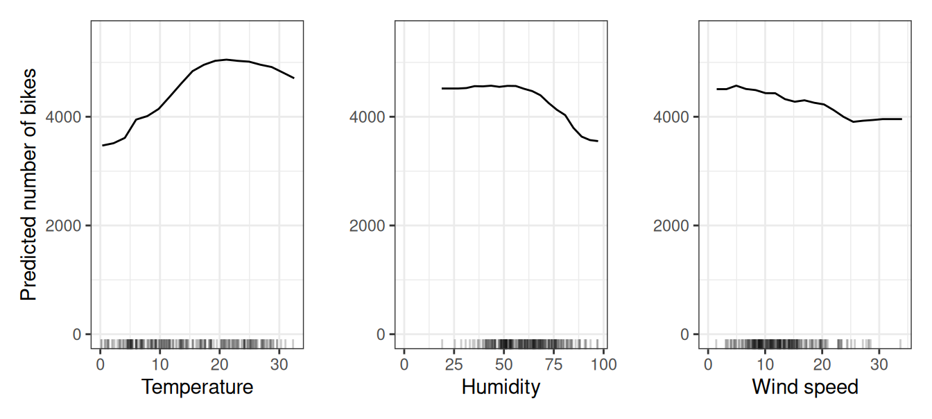
Let’s return to the regression example, in which we predict the number of bikes that will be rented on a given day. First, we fit a machine learning model, then we analyze the partial dependencies. In this case, we have fitted a random forest to predict the number of bikes and used the partial dependence plot to visualize the relationships the model has learned, see Figure 19.1. The influence of the weather features on the predicted bike counts is visualized in the following figure. The largest differences can be seen in the temperature. The hotter, the more bikes are rented. This trend goes up to 20 degrees Celsius, then flattens, and drops slightly around 30.
Potential bikers are increasingly inhibited in renting a bike when humidity exceeds 60%. In addition, the more wind, the fewer people like to cycle, which makes sense. Interestingly, the predicted number of bike rentals does not fall when wind speed increases from 25 to 35 km/h, but there is not much training data, so the machine learning model could probably not learn a meaningful prediction for this range. At least intuitively, I would expect the number of bikes to decrease with increasing wind speed, especially when the wind speed is very high.
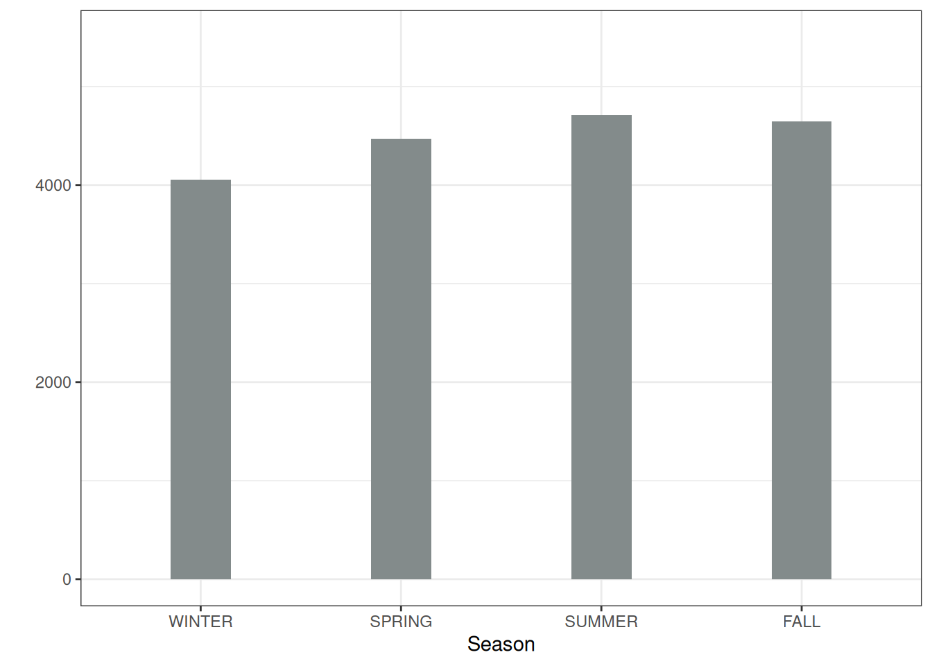
To illustrate a partial dependence plot with a categorical feature, we examine the effect of the season feature on the predicted bike rentals, see Figure 19.2. All seasons show a similar effect on the model predictions; only for winter, the model predicts fewer bike rentals, and slightly fewer for spring.
We also compute the partial dependence for penguin classification (male/female). To mix things up a little bit, we analyze both the random forest and the logistic regression approach. Both predict \(\mathbb{P}(Y^{(i)} = \text{female})\) based on body measurements. We compute and visualize the partial dependence of the probability for being female based on body mass and bill depth for the random forest (Figure 19.3). The heavier the penguin, the less likely it is female. We see a similar pattern for bill depth. The random forest PDP is way more rugged due to the decision-tree basis.
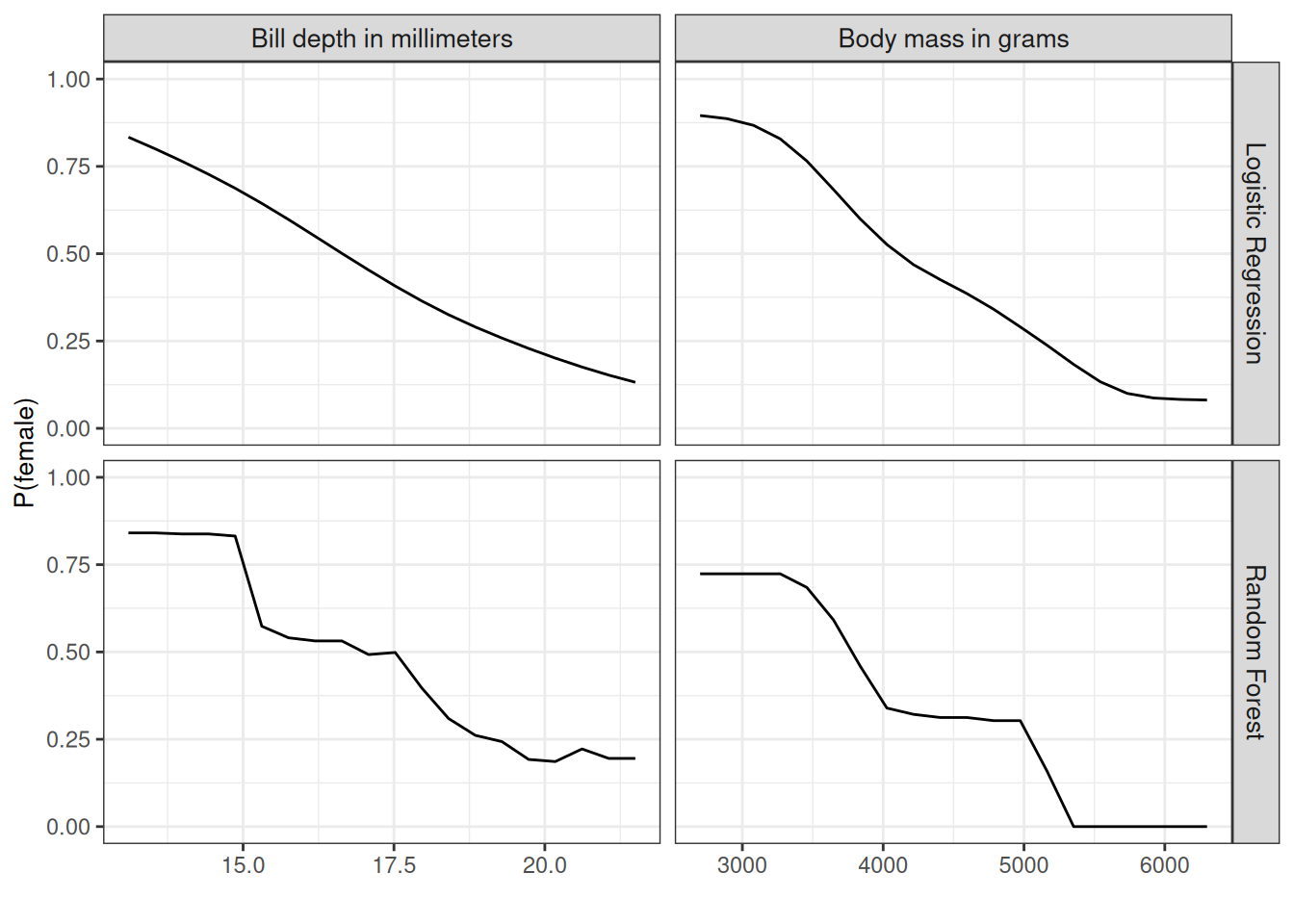
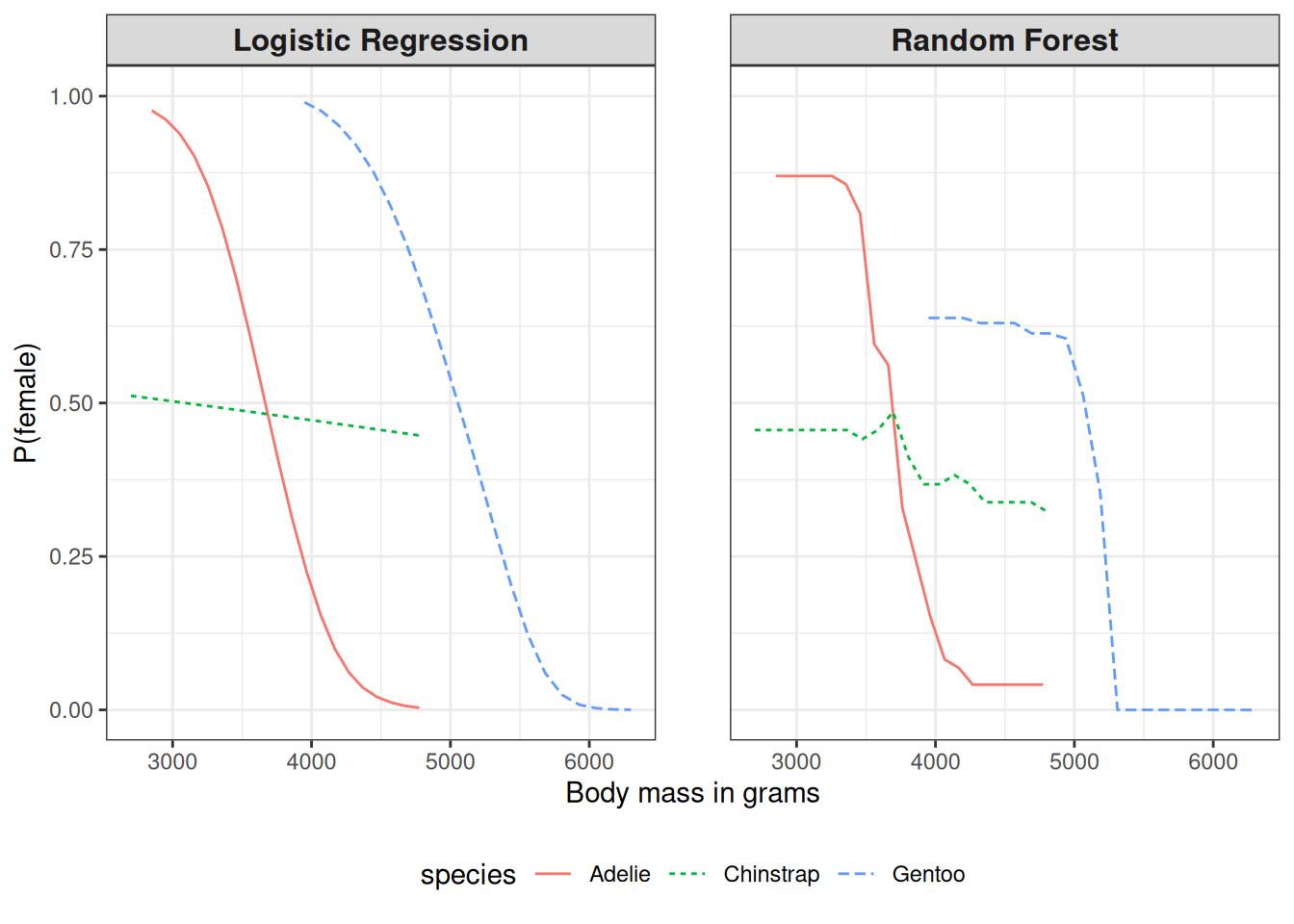
Figure 19.3 has a big problem: It throws all penguin species together. But we can easily compute the PDP by species. For this, we only have to compute the individual PDPs by subsetting the data and plotting the curves in the same plot, as I did in Figure 19.4. A more nuanced interpretation emerges. For Adelie, more weight means less likely to be female. For Chinstrap, the weight doesn’t affect the probability very much. Gentoo penguins are, in general, heavier but also show the “males are more heavy” pattern. Also, logistic regression is, surprise, surprise, smoother, and the random forest probabilities are drawn to the mean.
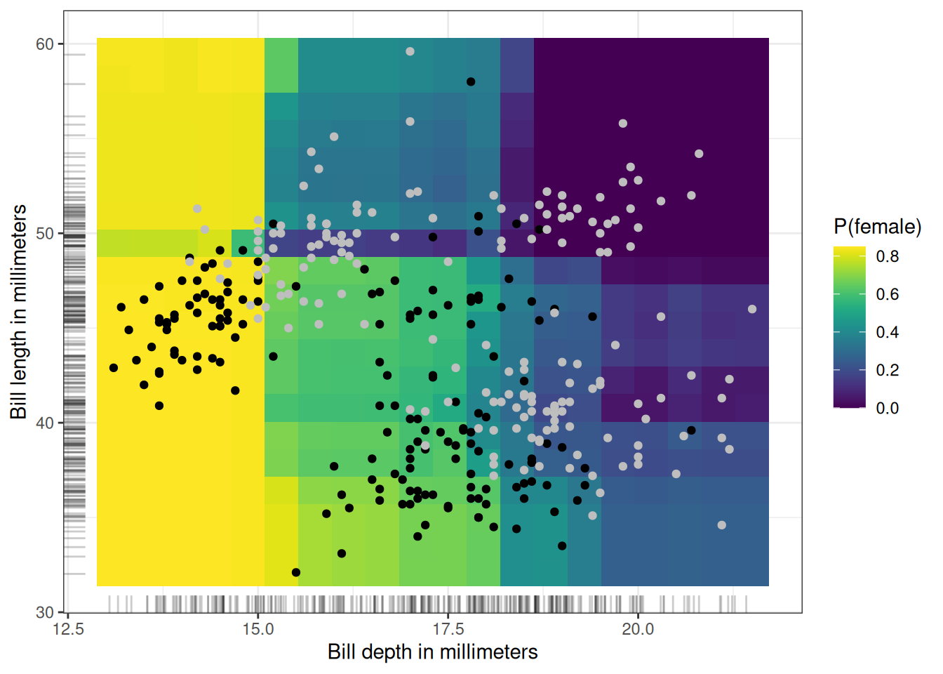
We can also visualize the partial dependence of two features at once (Figure 19.5): here, bill depth and bill length. The analyzed model is the random forest. There’s an interaction between the two, because at small bill depths, bill length doesn’t make a difference, but for longer bills, P(female) becomes smaller.
Reduce interactions, improve PDP interpretability
Even though PDP is a model-agnostic method, having a model with fewer interactions and more homogeneous effects makes the PDP interpretation simpler and reduces (some) risks of misinterpretation. Means to do this are reducing tree depth when using tree-based methods or adding monotonicity constraints. Alternatively, you can optimize for lower interactions, sparsity, and less complex effects in a model-agnostic way, see Molnar, Casalicchio, and Bischl (2020).
PDP-based feature importance
Greenwell, Boehmke, and McCarthy (2018) proposed a simple partial dependence-based feature importance measure. The basic motivation is that a flat PDP indicates that the feature is not important, and the more the PDP varies, the more important the feature is. For numerical features, importance is defined as the deviation of each unique feature value from the average curve:
\[I(\mathbf{x}_S) = \sqrt{\frac{1}{K-1}\sum_{k=1}^K(\hat{f}_S(\mathbf{x}^{(k)}_S) - \frac{1}{K}\sum_{k=1}^K \hat{f}_S(\mathbf{x}^{(k)}_S))^2}\]
Note that here the \(\mathbf{x}^{(k)}_S\) are the \(K\) unique values of feature \(X_S\). For categorical features, we have:
\[I(X_S) = \frac{\max_k(\hat{f}_S(\mathbf{x}^{(k)}_S)) - \min_k(\hat{f}_S(\mathbf{x}^{(k)}_S))}{4}\]
This is the range of the PDP values for the unique categories divided by four. This strange way of calculating the deviation is called the range rule. It helps to get a rough estimate for the deviation when you only know the range. And the denominator four comes from the standard normal distribution: In the normal distribution, 95% of the data are minus two and plus two standard deviations around the mean. So the range divided by four gives a rough estimate that probably underestimates the actual variance.
This PDP-based feature importance should be interpreted with care. It captures only the main effect of the feature and ignores possible feature interactions. A feature could be very important based on other methods such as permutation feature importance, but the PDP could be flat as the feature affects the prediction mainly through interactions with other features. Another drawback of this measure is that it is defined over the unique values. A unique feature value with just one instance is given the same weight in the importance computation as a value with many instances.
Strengths
The computation of partial dependence plots is intuitive: The partial dependence function at a particular feature value represents the average prediction if we force all data points to assume that feature value. In my experience, lay people usually understand the idea of PDPs quickly.
If the feature for which you computed the PDP is not correlated with the other features, then the PDPs perfectly represent how the feature influences the prediction on average. In the uncorrelated case, the interpretation is clear: The partial dependence plot shows how the average prediction in your dataset changes when the j-th feature is changed. It’s more complicated when features are correlated; see also disadvantages.
Partial dependence plots are easy to implement.
The calculation for the partial dependence plots has a causal interpretation. We intervene on a feature and measure the changes in the predictions. In doing so, we analyze the causal relationship between the feature and the prediction (Zhao and Hastie 2019). The relationship is causal for the model – because we explicitly model the outcome as a function of the features – but not necessarily for the real world!
Limitations
The realistic maximum number of features in a partial dependence function that can be meaningfully visualized is two. This is not the fault of PDPs, but of the 2-dimensional representation (paper or screen) and also of our inability to imagine more than 3 dimensions. However, it’s still possible to compute higher-order PDPs.
Some PD plots do not show the feature distribution. Omitting the distribution can be misleading because you might overinterpret regions with almost no data. This problem is easily solved by showing a rug (indicators for data points on the x-axis) or a histogram.
The assumption of independence is the biggest issue with PD plots. It is assumed that the feature(s) for which the partial dependence is computed are not correlated with other features. For example, suppose you want to predict how fast a person walks, given the person’s weight and height. For the partial dependence of one of the features, e.g. height, we assume that the other features (weight) are not correlated with height, which is obviously a false assumption. For the computation of the PDP at a certain height (e.g. 200 cm), we average over the marginal distribution of weight, which might include a weight below 50 kg, which is unrealistic for a 2 meter person. In other words: When the features are correlated, we create new data points in areas of the feature distribution where the actual probability is very low (for example, it is unlikely that someone is 2 meters tall but weighs less than 50 kg). One solution to this problem is Accumulated Local Effect plots or short ALE plots that work with the conditional instead of the marginal distribution.
Heterogeneous effects might be hidden because PD plots only show the average marginal effects. Suppose that for a feature half your data points have a positive association with the prediction – the larger the feature value, the larger the prediction – and the other half have a negative association – the smaller the feature value, the larger the prediction. The PD curve could be a horizontal line since the effects of both halves of the dataset could cancel each other out. You then conclude that the feature has no effect on the prediction. By plotting the individual conditional expectation curves instead of the aggregated line, we can uncover heterogeneous effects. However, ICE plots cannot indicate when the effect is positive or negative—a key aspect for interpretation. Suppose that the direction of the effect (positive or negative) depends on another feature—when the other feature’s value is above a certain threshold, the effect is positive and vice versa. Regional feature effect plots (Herbinger et al. 2024; Herbinger, Bischl, and Casalicchio 2022; Britton 2019; Gkolemis et al., n.d.) address this by partitioning data based on the conditioning feature and computing subgroup-specific PDPs. This approach clearly reveals under which condition the effect is positive or negative and reduces the overall heterogeneity.
Software and alternatives
There are a number of R packages that implement PDPs. I used the iml package for the examples, but there is also pdp and DALEX. In Python, partial dependence plots are built into scikit-learn, PDPBox and effector. Or you can use the Python Interpretable Machine Learning (PiML) library. effector also implements regional PDP plots.
Alternatives to PDPs presented in this book are ALE plots and ICE curves.